Table of contents
Intro
Sometimes, I encounter data that has discrete responses that occur in time frame of years. I found that visualize those variables can be quite tricky, such as using scatter plot where all variables lies at different level. In this post, I propose a solution for such problems using calendar heatmap from scratch in Python. This plot can also be used to visualize continuous response, which I will also demonstrate in the second half of this post.
Load library
import pandas as pd
import numpy as np
import requests
import io
import matplotlib.pyplot as plt
Calendar heatmap of Helsinki snowfall
data_links = 'https://avaa.tdata.fi/smear-services/smeardata.jsp?variables=pwd_smm&table=KUM_META&from=2018-01-01 00:00:00.102&to=2019-12-22 23:59:59.344&quality=ANY&averaging=NONE&type=NONE'

with requests.get(data_links) as response:
    df = response.content
    df = pd.read_csv(io.StringIO(df.decode('utf-8')))
A glance of data
print(df)
         Year  Month  Day  Hour  Minute  Second  KUM_META.pwd_smm
0        2018      1    1     0       0       0               0.0
1        2018      1    1     0       1       0               0.0
2        2018      1    1     0       2       0               0.0
3        2018      1    1     0       3       0               0.0
4        2018      1    1     0       4       0               0.0
...       ...    ...  ...   ...     ...     ...               ...
1038235  2019     12   22    23      55       0               NaN
1038236  2019     12   22    23      56       0               NaN
1038237  2019     12   22    23      57       0               NaN
1038238  2019     12   22    23      58       0               NaN
1038239  2019     12   22    23      59       0               NaN

[1038240 rows x 7 columns]
Combined to make column Time in datetime format
df['Time'] = pd.to_datetime(df[['Year', 'Month', 'Day', 'Hour', 'Minute', 'Second']])
df = df.drop(['Year', 'Month', 'Day', 'Hour', 'Minute', 'Second'], axis = 1)
# Rename column to Temp
df.rename(columns = {'KUM_META.pwd_smm' : 'Snow'}, inplace = True)
Aggregate daily temperature
df = df.groupby([df['Time'].dt.date]).mean()
df.index = pd.to_datetime(df.index)
Masking snow level
df.loc[df.Snow == 0, 'mask'] = "Not snowing"
df.loc[df.Snow != 0, 'mask'] = "Snowing"
Calendar heatplot
from matplotlib import colors
# Make dataframe for the calendar plot
value_to_int = {j:i+1 for i,j in enumerate(pd.unique(df['mask'].ravel()))}
df = df.replace(value_to_int)
cal = {'2018': df[df.index.year == 2018], '2019': df[df.index.year == 2019]}
# Define Ticks
DAYS = ['Sun', 'Mon', 'Tues', 'Wed', 'Thurs', 'Fri', 'Sat']
MONTHS = ['Jan', 'Feb', 'Mar', 'Apr', 'May', 'June', 'July', 'Aug', 'Sept', 'Oct', 'Nov', 'Dec']

fig, ax = plt.subplots(2, 1, figsize = (20,6))
for i, val in enumerate(['2018', '2019']):
    start = cal.get(val).index.min()
    end = cal.get(val).index.max()
    start_sun = start - np.timedelta64((start.dayofweek + 1) % 7, 'D')
    end_sun =  end + np.timedelta64(7 - end.dayofweek -1, 'D')

    num_weeks = (end_sun - start_sun).days // 7
    heatmap = np.full([7, num_weeks], np.nan)
    ticks = {}
    y = np.arange(8) - 0.5
    x = np.arange(num_weeks + 1) - 0.5
    for week in range(num_weeks):
        for day in range(7):
            date = start_sun + np.timedelta64(7 * week + day, 'D')
            if date.day == 1:
                ticks[week] = MONTHS[date.month - 1]
            if date.dayofyear == 1:
                ticks[week] += f'\n{date.year}'
            if start <= date < end:
                heatmap[day, week] = cal.get(val).loc[date, 'mask']

    cmap = colors.ListedColormap(['tab:blue', 'whitesmoke'])
    mesh = ax[i].pcolormesh(x, y, heatmap, cmap = cmap, edgecolors = 'grey')

    ax[i].invert_yaxis()
        # Hatch for out of bound values in a year
    ax[i].patch.set(hatch='xx', edgecolor='black')

    # Set the ticks.
    ax[i].set_xticks(list(ticks.keys()))
    ax[i].set_xticklabels(list(ticks.values()))
    ax[i].set_yticks(np.arange(7))
    ax[i].set_yticklabels(DAYS)
    ax[i].set_ylim(6.5,-0.5)
    ax[i].set_aspect('equal')
    ax[i].set_title(val, fontsize = 15)

# Add color bar at the bottom
cbar_ax = fig.add_axes([0.25, -0.10, 0.5, 0.05])
fig.colorbar(mesh, orientation="horizontal", pad=0.2, cax = cbar_ax)
n = len(value_to_int)
colorbar = ax[1].collections[0].colorbar
r = colorbar.vmax - colorbar.vmin
colorbar.set_ticks([colorbar.vmin + r / n * (0.5 + i) for i in range(n)])
colorbar.set_ticklabels(list(value_to_int.keys()))
fig.suptitle('Frequency of snow', fontweight = 'bold', fontsize = 25)
fig.subplots_adjust(hspace = 0.5)

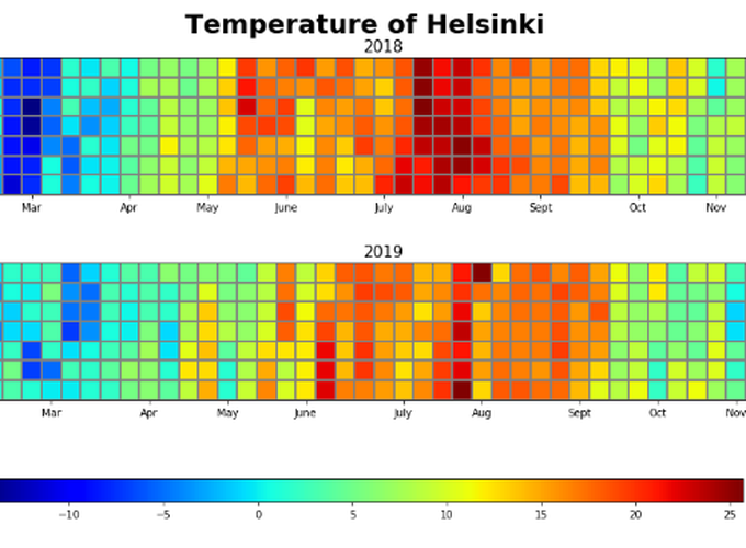
Calendar heatmap of Helsinki temperature
data_links = 'https://avaa.tdata.fi/smear-services/smeardata.jsp?variables=t&table=KUM_META&from=2018-01-01 00:00:00.112&to=2019-12-31 23:59:59.408&quality=ANY&averaging=NONE&type=NONE'

with requests.get(data_links) as response:
    df = response.content
    df = pd.read_csv(io.StringIO(df.decode('utf-8')))
A glance of data
print(df)
         Year  Month  Day  Hour  Minute  Second  KUM_META.t
0        2018      1    1     0       0       0        -0.3
1        2018      1    1     0       1       0        -0.4
2        2018      1    1     0       2       0        -0.4
3        2018      1    1     0       3       0        -0.4
4        2018      1    1     0       4       0        -0.4
...       ...    ...  ...   ...     ...     ...         ...
1038235  2019     12   22    23      55       0         NaN
1038236  2019     12   22    23      56       0         NaN
1038237  2019     12   22    23      57       0         NaN
1038238  2019     12   22    23      58       0         NaN
1038239  2019     12   22    23      59       0         NaN

[1038240 rows x 7 columns]
Combined to make column Time in datetime format
df['Time'] = pd.to_datetime(df[['Year', 'Month', 'Day', 'Hour', 'Minute', 'Second']])
df = df.drop(['Year', 'Month', 'Day', 'Hour', 'Minute', 'Second'], axis = 1)
# Rename column to Temp
df.rename(columns = {'KUM_META.t' : 'Temp'}, inplace = True)
Aggregate daily temperature
df = df.groupby([df['Time'].dt.date]).mean()
df.index = pd.to_datetime(df.index)
Plot calendar heatmap
from matplotlib import colors

# Turn data frame to a dictionary for easy access
cal = {'2018': df[df.index.year == 2018], '2019': df[df.index.year == 2019]}

# Define Ticks
DAYS = ['Sun', 'Mon', 'Tues', 'Wed', 'Thurs', 'Fri', 'Sat']
MONTHS = ['Jan', 'Feb', 'Mar', 'Apr', 'May', 'June', 'July', 'Aug', 'Sept', 'Oct', 'Nov', 'Dec']

fig, ax = plt.subplots(2, 1, figsize = (20,6))
for i, val in enumerate(['2018', '2019']):
    start = cal.get(val).index.min()
    end = cal.get(val).index.max()
    start_sun = start - np.timedelta64((start.dayofweek + 1) % 7, 'D')
    end_sun =  end + np.timedelta64(7 - end.dayofweek -1, 'D')

    num_weeks = (end_sun - start_sun).days // 7
    heatmap = np.full([7, num_weeks], np.nan)
    ticks = {}
    y = np.arange(8) - 0.5
    x = np.arange(num_weeks + 1) - 0.5
    for week in range(num_weeks):
        for day in range(7):
            date = start_sun + np.timedelta64(7 * week + day, 'D')
            if date.day == 1:
                ticks[week] = MONTHS[date.month - 1]
            if date.dayofyear == 1:
                ticks[week] += f'\n{date.year}'
            if start <= date < end:
                heatmap[day, week] = cal.get(val).loc[date, 'Temp']
    mesh = ax[i].pcolormesh(x, y, heatmap, cmap = 'jet', edgecolors = 'grey')

    ax[i].invert_yaxis()

    # Set the ticks.
    ax[i].set_xticks(list(ticks.keys()))
    ax[i].set_xticklabels(list(ticks.values()))
    ax[i].set_yticks(np.arange(7))
    ax[i].set_yticklabels(DAYS)
    ax[i].set_ylim(6.5,-0.5)
    ax[i].set_aspect('equal')
    ax[i].set_title(val, fontsize = 15)

    # Hatch for out of bound values in a year
    ax[i].patch.set(hatch='xx', edgecolor='black')

# Add color bar at the bottom
cbar_ax = fig.add_axes([0.25, -0.10, 0.5, 0.05])
fig.colorbar(mesh, orientation="horizontal", pad=0.2, cax = cbar_ax)
colorbar = ax[1].collections[0].colorbar
r = colorbar.vmax - colorbar.vmin
fig.suptitle('Temperature of Helsinki', fontweight = 'bold', fontsize = 25)
fig.subplots_adjust(hspace = 0.5)
